Loading presentation…
Loading presentation…


Get your best work seen.
James Eagle · Eeagli · james.eagle@eeagli.com
If people can't see the point, they can't act.
Trained to find the answer, not to show it. Complex thinking becomes a correct but unreadable chart.
Firms own every charting tool. Nothing joins research, design, review and publication together.
Colours, disclaimers and approvals arrive last, consume time and bury the point.

Fast for analysis. Weak for repeatable, publishing.

Good for exploring and dashboards. Less for external publishing.

Powerful and flexible. Too manual for everyday chart production.

Useful for one-off builds. Not a workflow for brand, review and approvals.

Great for visual storytelling. Not for the full publishing chain.

Excellent for polish. Disconnected from live data, compliance and sign-off.
Each one does its job. Nothing joins them up.
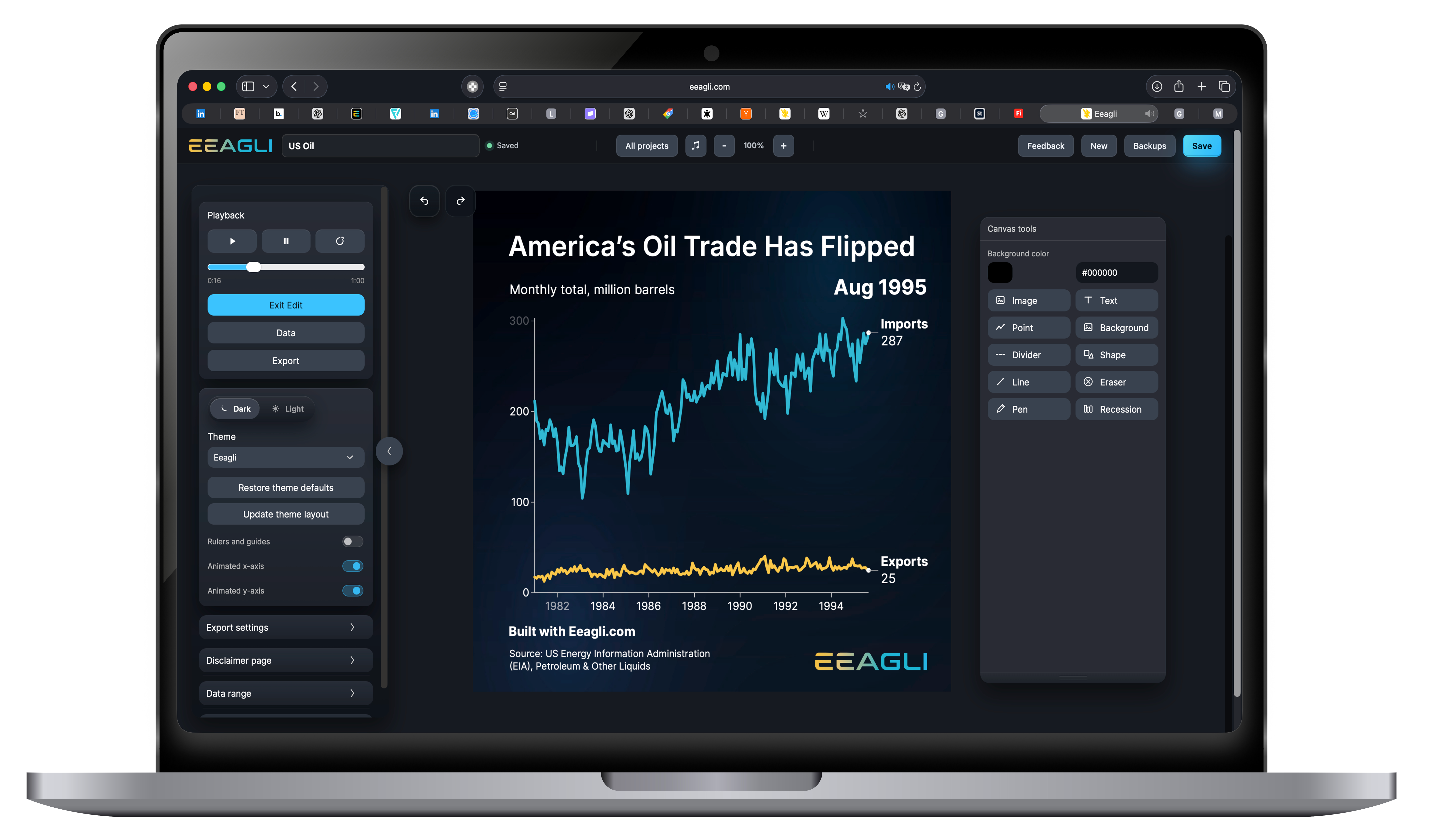
Add data
Add brand guidelines and disclaimers
Build the chart
Review and sign-off
Publish anywhere
Guidelines, source notes and disclaimers go on before approval, not after.
Consistent charts, animations and web visuals for reports, decks, social and websites.
Less manual formatting and rework, so teams focus on what the chart is saying.
Square, portrait and video sizes, with safe zones for captions and platform controls.
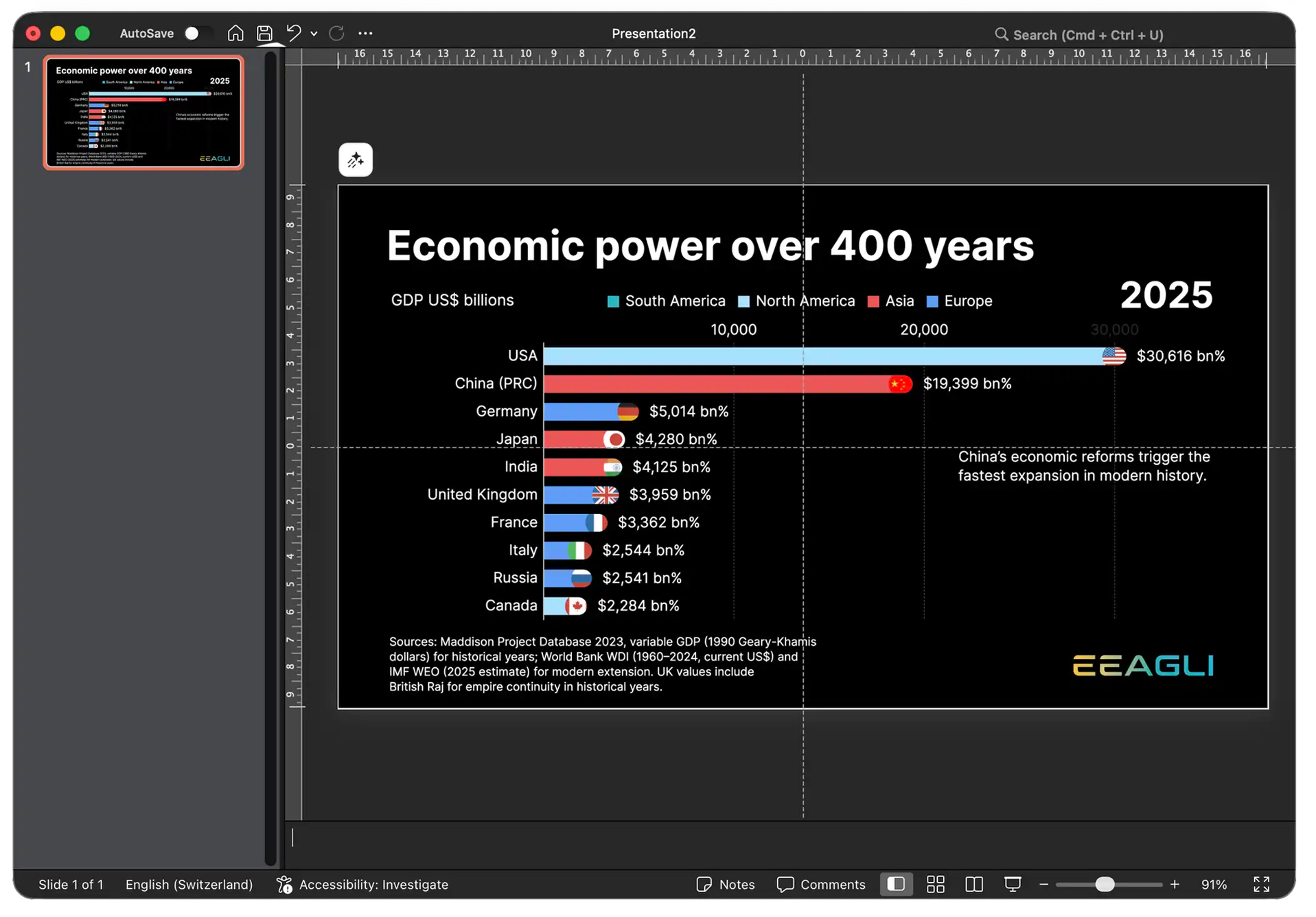
Drops straight into a slide at the right size, and updates when the data does.
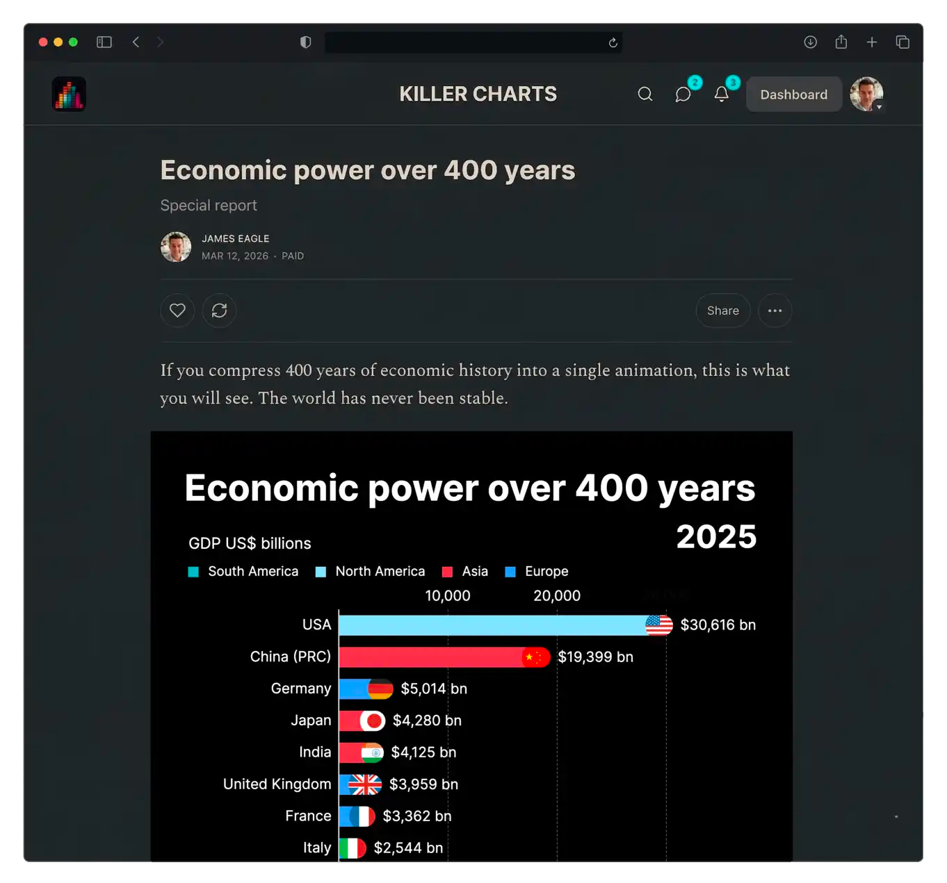
Embeds live on your site, responsive, with the disclaimer attached.
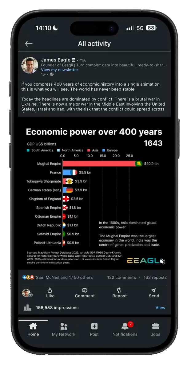
One saved project, three destinations.
Published to 234,000 followers. Several went viral.
Clients including PIMCO, Interactive Investor and National Bank of Canada have paid for work produced this way.

James Eagle · Eeagli · james.eagle@eeagli.com